The start of the year is a great time to review your website, especially if you’re planning to launch new offers or you’ve set new goals. In this blog, I’m sharing some of the common website mistakes I’ve seen during website reviews for over 20 service and product-based businesses. I’m also sharing some easy fixes (that don’t include deleting your website and starting again).
1. A home page doesn’t tell me what you do or who you do it for.
When someone lands on your page, you’ve got about 10 seconds to capture their attention.
Action: Make sure you share your Unique Selling Proposition (USP):
- Who are you?
- What do you do?
- Who do you do it for?
- How do you do it better than anyone else?
2. No detail about you, your products or services on the home page.
Think of your home page like a magazine cover that provides a snapshot of the content on your website
Action: Add a brief introduction to you and your business that links to your about page, as well as an overview of your services, courses or products.
3. An about page that reads like your life story
Or, has no information about you at all. Your about page is an opportunity to share the values and beliefs of your business. It’s also your chance to explain how you can solve your clients’ problem.
You can introduce you and your staff, but it doesn’t need to be your life story.
As your business grows, you can expand the page to include articles and podcasts you’re featured in, or causes you support. Have a look at my about page for some inspiration.
4. Pages that don’t have enough information on them
Depending on who you ask, you might be told that pages need between 150-300 words for Google to rank them.
But what’s more important is having enough information to answer the questions website visitors have about your product or service.
5. Long sentences and blocks of text
Aim to keep your sentences under 20 words so they are easy to read, especially on a mobile. And avoid big chunks of text, which might look ok on a desktop.
Action: Use a tool like Hemingway or Grammarly to check the length of your sentences, and aim to have a mix of shorter and longer sentences.
Use bullet points instead of long sentences and break up large chunks of text with headings.
6. The copy is all written in passive voice
Active voice is usually shorter and more straightforward.
Active: Please remove your shoes before entering my house.
Passive: Shoes should be removed before entering my house.
Action: You can also check passive voice in Hemingway.
7. No detail about your products or services
Whether you’re an eCommerce store, a coach, or course creator or a service provider, you need to add enough information to make it easy for website providers to buy.
Action: If you’re an eCommerce store, make sure you’re including detail about your product. This might include:
- Size
- Colours
- Materials and construction
- User guides
- FAQ
If you’re a service provider, you also need to add details.
- Who is the service for?
- How does it work?
- What is included?
Packaging up your services and adding a price (even if it’s from $XXX) can help.
Check out my sales pages for service providers blog for some additional suggestions.
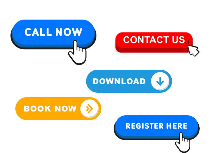
8. There’s no call to action
On every page, your website visitor should have a clear idea of what they need to do next. Make it easy for them to get in touch with you, buy your product or service or book a call.
Action: Add a call to action, which could include booking a call or signing up for more information.
9. There is no proof of your skills or previous work
Unless you’re getting personal referrals, your website visitor doesn’t know whether you’re any good. Share logos and testimonials from previous clients, as well as award wins, memberships and accreditations to build trust.
Action: Add a testimonials page to your website and list your testimonials. You can also add testimonials about specific services to your service pages. Make asking for testimonials part of your end of project process.
10. The website menu is confusing
There are too many layers and you’ve called pages by quirky or unusual names.
Action: Make it easy for people to find the pages they need. Stick with easily recognised terms like services, about or blog.
If you have multiple service or course sub-pages, make sure you have a landing page so people can get an overview of what you offer. Check out my services page for reference.

11. Images are too big
Big images aren’t just distracting. They can also slow your website down, which is annoying for the user and can affect how Google ranks your website.
Action: Use a website like tiny.png to resize your images
12. There are too many fonts and colours and the copy is hard to read
Stick to a couple of fonts, one for your copy and one for your headings. Don’t use fancy fonts that are hard to read. And be careful with colours and contract.
Action: If you google website accessibility there are loads of resources for checking your website content is accessible and easy to read.
13. You have an Instagram feed on your website
Having your Instagram feed on your website might seem like a good idea, especially if you’ve got a carefully curated feed that creates an appealing gallery. But it can slow your website done. More importantly, the risk is people click away from your website and get lost down a social media rabbit hole.
Action: Remove the feed and add a selection of correctly sized and named images.
14. You’re not collecting emails
We’d like to think everyone coming to our websites buys on the first visit, but that’s not always the case. You need to collect emails and build your list. Having loads of followers on social media might seem nice. But building your business on social media is like building your house on someone else’s land.
Action: Put together a simple opt-in, like a checklist or discount, and start collecting emails. But if you have a pop-up, make sure it doesn’t pop for 45 seconds or until the end of the page. And make sure it’s disabled on mobile.
15. There are no contact details
Make it easy for people to get in touch with you.
Action: Include your mobile (make sure it’s click to call), add a map and your address and link to your social media.
16. SEO information missing or incorrect
SEO (or search engine optimisation) is the key to ensuring your website gets found online. Even if you’re working with a copywriter or website developer, I highly recommend having a basic understanding of SEO.
Action: Check out Kate Toon’s free SEO Nibbles course for a basic overview of SEO.
How does your website measure up?
Have you found any of these common website mistakes on your site?
Are there changes you can implement to improve the user experience on your website?
And if you need some help to update your website, get in touch – I’m sure I can help.
