How sales page copy and design work together to turn clicks into clients
Are you selling services, a course or membership, or a subscription box online?
Yes?
But if you’re hearing crickets instead of the perfect ping of a payment notification, your sales page isn’t doing the heavy lifting.
Now I’d love to tell you that brilliant copy alone can fix everything (I am a sales page copywriter after all), but the truth is, your page works best when you combine sales page copy and design.
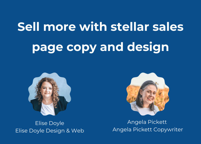
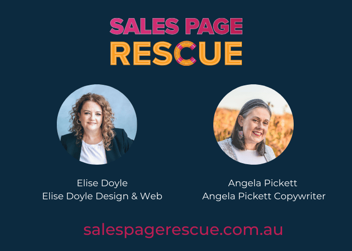
I’m Angela Pickett, a sales page copywriter based in the Barossa Valley, and I wrote this blog with my sales page partner-in-crime, web designer and developer Elise Doyle. Together, we run Sales Page Rescue workshops to help business owners like you write and design sales pages that actually sell (without feeling gross and salesy).
You bring the offer, we’ll bring the words and the visuals that help people say yes.
Is this for you?
You’ll get the most out of this if you’re a:
- Service provider, coach or consultant
- Course or membership creator
- Retreat or event host
- Product or subscription box business
And even better if you:
- Have an offer you’re proud of, but your current page doesn’t do it justice
- Feel awkward about ‘selling yourself’
- Know your website could work harder, but you’re not sure where to start
If you’re nodding along, then you’re in the right place.
What we’ll cover
In this blog, we’ll explain how sales page copy and design work together so that your sales page:
- Guides people smoothly from first click to ‘sign me up’
- Makes a strong first impression (without shouting)
- Uses visuals to support (rather than distract) from your message
- Feels easy to read, easy to trust and easy to buy from
- Works on mobile, not just your nice big desktop screen
- Uses clear, simple calls-to-action that get clicked.
By the end of this blog, I’m confident you’ll know what to focus on, and what you can let go.
Why every offer deserves a proper sales page
For a long time, I thought sales pages were only for fancy online entrepreneurs with expensive programs and huge launches.
Just hearing the word sales made me cringe, thinking of sleazy tactics, fake countdown timers and pushy marketing.
But over the last few years, I’ve changed my mind.
Now I see sales pages as one of the kindest tools you can give potential clients.
A good sales page pulls everything they need into one place to help them make a decision, without digging all over your website.
A strong sales page usually includes:
- What the offer is and what’s included
- Who it’s for, and who it’s not for
- Proof in the form of testimonials, case studies, results
- Pricing, payment options and bonuses
- FAQs that handle common worries and those niggling what if questions
- A guarantee and clear fine print
- Obvious CTA buttons that tell them what to do next
Having a sales page isn’t about tricking anyone. It’s about being clear, honest and helpful.
1. Map the customer journey before you start
Before I write a single headline, I want to know how someone ends up on your sales page, and what happens after they’ve clicked the buy now button.
You’ve put time and heart into creating your service, course or membership. Now we want to make it easy for people to buy it.
Think about:
- How people first hear about you? Do they join a waitlist, or can they buy right away?
- What happens between ‘I’ve heard of you’ and ‘I’m ready to buy’?
- How do you take payment, and what happens immediately after?
Ideally, you’ll have:
- A lead magnet (like a checklist or guide) to encourage people to sign up for your email list
- A sequence of nurture emails to build trust and explain the offer
- Sales page copy that does the deep-dive selling
- Simple post-purchase emails that confirm, reassure and onboard
From a design and tech angle, does the whole flow feel smooth?
That means no:
- dead ends
- confusing steps
- “where do I click now?” moments.
When you map the journey, your sales page becomes one important part of a bigger, calmer picture, and not a frantic last-minute add-on.
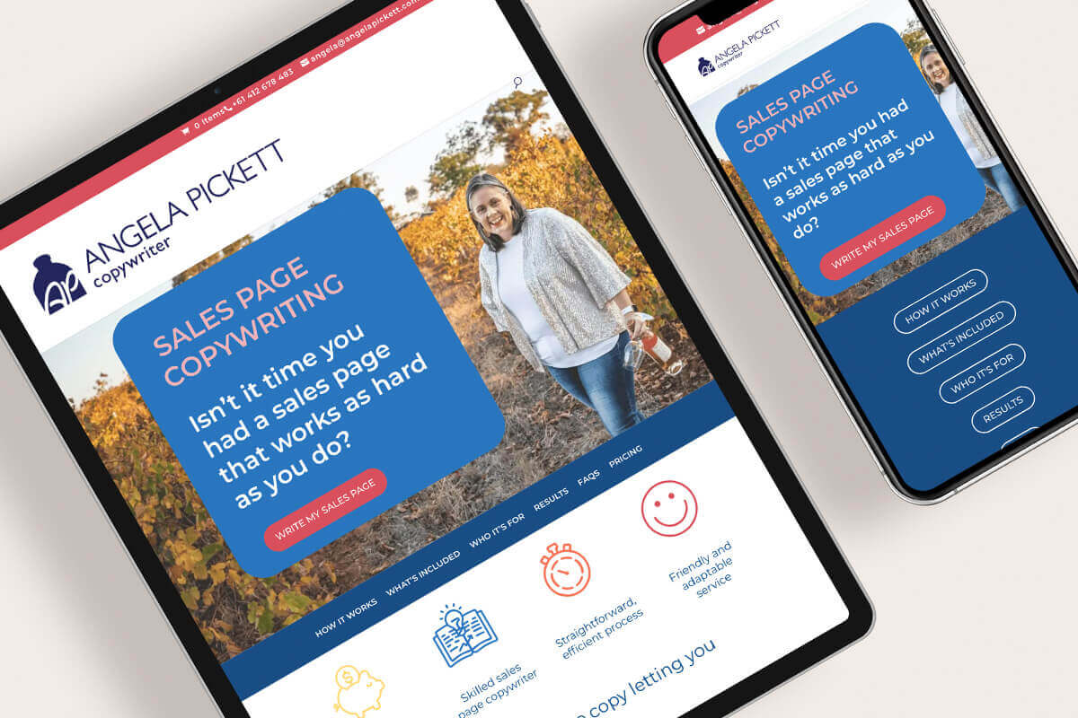
2. First impressions matter – what people see before they scroll
The first screen of your sales page, the bit you see before you scroll (sometimes referred to as above the fold), carries a lot of weight.
Visually, you want:
- a clean, on-brand layout
- design that feels like the rest of your site (so people know they’re in the right place)
- plenty of breathing space – not 10 things shouting at once.
Copy-wise, this section needs to answer:
- What is this?
- Who is it for?
- Why should I care?
You can do that with:
- a clear, benefit-driven headline
- a short subheading that explains the offer
- a simple primary CTA button, like ‘Book now’ or ‘Join the program’.
If someone reads only that top section, they should still understand what you’re offering and whether it’s worth scrolling.
3. Use visual storytelling to back up your message
Strong sales pages use design to back up the story the copy is telling.
It’s more than just looking pretty.
Elise uses things like:
- icons and shapes to break up text and guide the reader’s eye down the page
- colours and fonts that match the rest of your brand
- photos, screenshots or mock-ups showing your offer in action
At the same time, the copy:
- explains what those visuals mean
- ties each visual to a clear benefit
- shows you understand your reader’s frustration – and how your offer helps
In other words:
- design helps people feel and follow the story
- copy helps them understand and decide.
For your sales page to be effective, you need both.
4. Make it easy to move through the page
You don’t want your sales page to feel like a long, winding bush track with no signs.
From a user experience (UX) point of view, it should feel more like a well-marked walking trail:
- You know where you are
- You can see what’s coming up
- You can take shortcuts when you want to
Design elements that support this include:
- an on-page menu or jump links to sections like What’s included, Pricing and FAQs
- clear section headings and blocks
- enough white space so it doesn’t feel overwhelming.
From the copy side, some of the most common mistakes I see are:
- huge chunks of text that repeat the same idea
- important details hidden in the middle of paragraphs
- no obvious flow from problem → solution → proof → details → decision.
On longer pages, you also need multiple calls-to-action.
Keep the button text:
- clear
- consistent
- boring (in the best possible way)
Your CTA should finish the sentence:
“I want to…”
For example:
- I want to book now
- I want to buy now
- I want to join today
Save the quirky, fun language for your headings and body copy.
Your buttons are there to do a job.
5. Build trust and credibility where it counts
People are more likely to buy when they feel safe and confident. That’s where trust and credibility come in.
Good design builds trust with:
- consistent use of your logo, colours and fonts
- simple, polished layouts without clutter
- visuals like certifications, awards or client logos (if relevant).
Copy builds trust when it:
- clearly explains the benefits and value of your offer
- avoids overblown promises you can’t back up
- sounds like one brand, one voice and not a patchwork of different writers
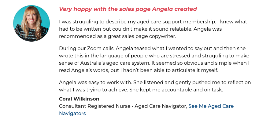
And it’s even better when you can back it up with social proof like:
- testimonials
- case studies
- screenshots of feedback or results.
Add a clear guarantee or basic fine print while you’re there.
A simple “here’s what happens if” paragraph can do a lot to calm last-minute nerves.
6. Use emotional – but keep it ethical
We all like to think we buy based on logic, but emotion is usually in the driver’s seat.
Design can tap into emotion with:
- real photos of you, your team or your clients
- visuals that show what life could look like after working with you
- genuine urgency cues like ‘Only 10 spots’ or ‘Doors close 30 June’
From a copy perspective, we use emotion by:
- naming the real problem, not just the surface-level symptoms
- reflecting how that problem feels for your audience
- painting a grounded picture of what’s possible on the other side.
Using urgency and FOMO is fine but only if it’s true.
- A genuine deadline
- Limited spots
- A bonus that disappears at a certain time
And because it’s poor form (and sometimes illegal), we don’t use:
- anything that makes people feel tricked.
- fake countdown timers
- false ‘today-only’ offers that reset the next day
The aim is simple:
If they’re not the right fit, they feel comfortable clicking away (and will come back when they’re ready).
If they’re the right fit and ready, they feel confident clicking ‘Buy now’.
7. Help people (and Google) find your page
A brilliant sales page can only convert the people who actually land on it.
Best practice tech and design include:
- Page speed (especially if there are videos and big images)
- Optimised image sizes
- Caching (for WordPress sites)
- Clean code and proper use of H1, H2, H3 headings
On the copy side, you need to choose a primary keyword for your offer (like ‘sales page copywriter’ or ‘online Pilates membership’) and use it in:
- Your main headline (H1) and a couple of subheadings
- Your body copy (naturally)
- Image file names and alt text
- Your title tag and meta description
The goal is to help the right people find you, not to stuff your page with awkward phrases.
If SEO feels overwhelming, start with the basics and build from there. You don’t need to be an SEO expert to make a real difference.
Need some tips on SEO? I recommend Kate Toon’s free SEO Nibbles course.
8. Make it friendly for mobile readers
Many of your website visitors will read your sales page on their phone, often while multitasking.
Design-wise, that means:
- fonts that are readable on small screens
- buttons that are easy to tap
- layouts that stack neatly rather than turning into a jigsaw puzzle.
From a copy perspective, long, winding sentences that look ‘fine’ on a desktop can be hard to read on a phone.
To keep your copy mobile-friendly, aim for:
- clear headings and subheadings
- bullet points instead of big paragraphs
- shorter sentences (under 20 words), with the occasional longer one for variety
- contractions (you’re, it’s, you’ll) so your writing sounds human.
If you can read it out loud without needing to take a breath halfway through, you’re on the right track.
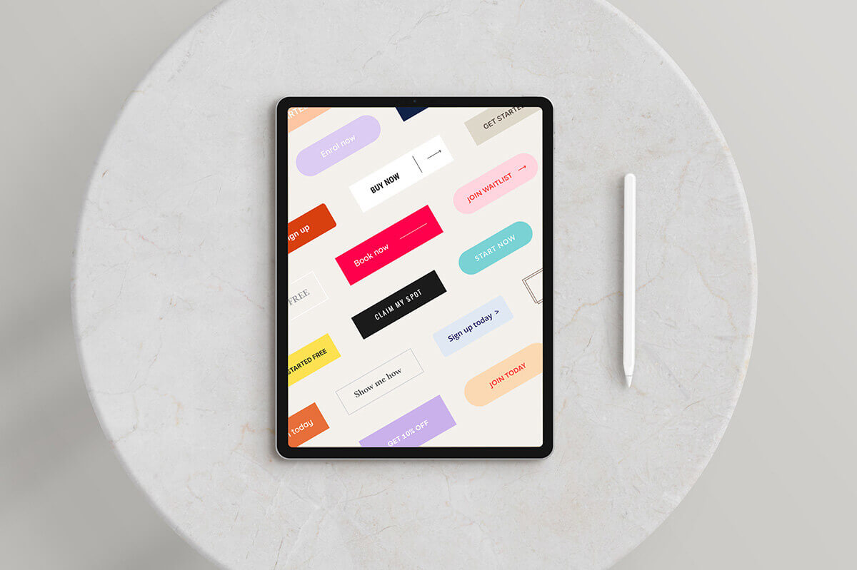
9. Design CTAs that get clicked
Your call-to-action (CTA) is the bridge between ‘this sounds interesting’ and ‘Sign me up’.
From a design viewpoint:
- use a button colour that stands out clearly from your headings and other brand colours
- stick with the same colour for every main CTA button on the page
- make sure clicking the button takes people straight to the final pricing or sign-up section.
From a copy viewpoint:
- keep your CTA text simple and consistent
- use strong action words
- let the button finish the sentence ‘I want to…’
Some solid, fuss-free CTAs:
- Book now
- Sign up now
- Buy now
- Join today
- Start now
- Claim my spot
Don’t reinvent the wheel. Clarity beats clever every time.
Common sales page mistakes we see
- Pages that look like generic services pages, not focused sales pages.
- Big blocks of text and no clear sections.
- Three or four different CTAs (“Learn more”, “Find out more”, “Book now”) on one page
- Testimonials hiding on a separate page instead of where they matter
- Pricing, inclusions and FAQs at the bottom (with no menu)
- No clarity about who the offer is for, or NOT for.
Quick recap
We’ve shared a bit of info, so here’s the TL:DR version of our sales page copy and design tips:
- Copy and design need to work together if you want your sales page to convert.
- Map the customer journey first so your page fits into a bigger picture.
- Make your first screen clear, not clever.
- Use visuals to support your message, not drown it out.
- Build trust with consistent branding, social proof and a clear guarantee.
- Keep things ethical: no fake scarcity, no trickery.
- Check your page on mobile and tidy up the basics of SEO.
- Use simple, consistent CTAs, repeated throughout the page.
Need help to rescue your sales page?
If you’re looking at your current sales page and thinking ‘ouch, this needs some work’, you’re not alone.
Sales Page Rescue Workshop – February 2026
We’re running our first Sales Page Rescue workshop for 2026 on 17 February, and we’d love you to join us.
- Format: Live online workshop
- Time: 10am – 12pm AEDT (2 hours)
- Investment: $197
In the 2 hour online workshop, we’ll walk you through:
- The key sections every sales page needs
- What to say in each one (without sounding sleazy or salesy)
- Simple design tweaks that make it easier for people to read and buy
You’ll also get:
- A comprehensive workbook
- Checklists and design templates
- Access to the recording so you can rewatch and keep improving your page
If you want professional eyes on your sales page and a clear, practical plan to strengthen it, the Sales Page Rescue workshop is your next step.
About us
Elise Doyle – web designer and developer
Elise is an experienced, down-to-earth web designer and developer who combines creativity, technical know-how and SEO basics to build websites that look good and work hard.
She specialises in creating sales pages and websites that feel like you, work smoothly in the background and help turn visitors into paying clients.
Angela Pickett – sales page copywriter
I’m a sales page copywriter who’s worked with small and large businesses, non-profits and government.
I bring my love of a good love story to sales pages, helping you attract the right people, build genuine connections and create long-term relationships with your business.
In 2025, Elise and I launched the Sales Page Rescue workshop to help business owners create their own sales page magic – with the right words and design to match.
You can visit our websites to learn more about our sales page copywriting and design packages. Or visit our Sales Page Rescue page to book your workshop ticket.
Let’s keep the conversation going
If you liked this blog, we’d love for you to share it with your network.
And if you’ve got a question about your own sales page or you’re not sure where to start, you can:
- Get in touch via our websites
- Follow us on social media
- Join our mailing list for more practical tips on sales page copy and design
Ready to turn your sales page into the hardest-working page on your website?
We’d love to help you get there.
